An Eye Tracking Study
MFTA Website Usability Testing & Recommendation
Background
JetBlue Airways is a major American low cost airline, and the seventh largest airline in the United States by passengers carried. To evaluate the effectiveness of the Jetblue Airlines homepage in helping travelers plan trips and adjust to COVID-19 travel regulations, three usability experts at Pratt Institute conducted an eye-tracking study.
Eye Tracking Usability Study
Duration: Approximately 4 weeks
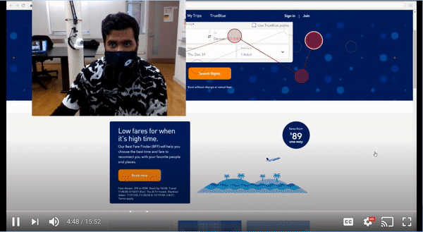
Team: Leslie Lopez, Devin Singh
Contribution: Interviewing stakeholders, Prototyping, Usability Testing, Eye Tracking
How might we enhance the usability of the JetBlues booking site for users during COVID?
The Problem
RESEARCH QUESTIONS
-
How do users interact with the homepage and understand it’s content?
-
How discoverable is COVID- 19 travel regulations from the homepage?
-
What are the pain points associated with booking a flight?
-
How have has travel considerations changed pre- and post- covid-19?
-
Highlight possible usability concerns and provide recommendations.
MY GOAL
Consolidate recommendations to tackle the usability problems target users encountered during the usability eye tracking test.
Our Process

1. Preparing for the study
SETTING UP TOBII PRO
To capture and collect data during this study we used an eye tracker tool called Tobii Pro Lab which accurately captures and tracks users' eye movement. It took us quite some time setting up Tobii Pro remotely. With this tool we were able to observe and understand where and how users are looking. We were nervous because it was our first time and we only have one chance with our participants, so we tested the equipment twice before test day.


TAKING THE COVID TEST
We took the COVID test in order to return to campus for the eye tracking session with our three participants.
WRITING A SCRIPT AND CONSENT FORM
We also wrote a script to guide our session and also to minimize variables among different testers.
A Little User Demographics

We recruited another three Pratt students (one male and two female).

2. Recruitment & Sending out Pre-test Questionnaires
PRE-TEST QUESTIONNAIRE
Generated on Google Forms, our pre-test questionnaire aimed at understanding the basics user demographics and preference for booking air flights.


3. Eye Tracking Test & Data Collection
TASKS & PROCESS
We asked each participant to complete the following tasks which were designed to gain insight into a user experience using the JetBlues Airline booking site and to identify usability problems they face when completing the tasks. During each task, we asked them to speak aloud their thought and provide any feedback based on their booking experiences in the past. After the test, we asked the participants to fill out a post-test questionnaire and asked them to rank the tasks by its level of difficulty.

DUAL MONITOR SETUP
Participants sat in front of the first monitor with Tobii Pro while the moderator sat next to the participant for direct communication. At the same time, two other team members observed the testing from behind and took notes. This set-up saved time but also helped us gain richer qualitative insights backed up with real time user reactions.

Participant

Moderator (me)
4. Quantitative & Qualitative Data Analysis
QUALITATIVE ANALYSIS: NOTES & RECORDINGS
We rewatched video recordings and revised our notes from the eye-tracking test.

QUANTITATIVE ANALYSIS: HEATMAP & GAZE PLOTS
We analyzed the heatmap and gaze plot data of all three sessions.


USABILITY PROBLEM SHEET
We combined our findings on a Usability Problem Sheet based on the following categories:
● The Content category has problems related to unclear or missing information, labeling, or descriptions
● The Function category has problems related to missing functionalities or features
● The Visual category has problems related to unclear or missing wayfinding arrows/path, icons, or signifiers

Main Findings

Recommendations
1. Users did not notice the Covid Information Banner at first glance
Users’ eyes gravitated to the date selection module, which contributed to the banner being overlooked especially at the start of their sessions.

3 out of 3 participants did not immediately notice the banner at the top which contained information related to COVID-19 and travel regulations, unless prompted.
➝Prioritize content hierarchy with color contrast
Sometimes it’s as simple as changing colors. In this case, the color does matter and would make a huge difference in discoverability for important information regarding health and quarantine policies. Using orange would be more consistent with JetBlue branding, while red is consistent with COVID-related banners among other sites.

2. Users did not understand JetBlue package labeling

3 out of 3 users did not understand JetBlue package labeling, which allude to the idea that users are unfamiliar with JetBlue need stronger signifiers and labels to increase understanding.
➝More differentiable naming convention & Labeling

3. Overwhelming amount of text on the health advisory page
Users preferred content setups that allows them to skim. Quick menus and guides were favored overall.

3 out of 3 participants commented on feeling overwhelmed by the text they had to read to locate quarantine information. Nearly two minutes were spent skimming text.
In a video, a participant expresses concern with text while completing task two & favor for the quick guide.
➝Make content more discoverable by organizing based on priority & using quick guides.

4. Users found that the flight booking page lacked hierarchy
Users missed the step indicator and help icons when orienting themselves. User eyes instead gravitated toward the distinct icons, but they were of little help.


➝Improve visual hierarchy & fit user's mental model by using clearer color patterns and signifiers

Key
Takeways
EYE TRACKING WAS FUN
I really enjoyed this project and had a blast throughout the entire process. Although we were a little stressed at the beginning, but everything went as planned in the end.
REMOTE COLLABORATION
Working remotely teamwise during the pandemic was challenging since half of the team was on the other side of the globe. We made it work through "asynchronous" discussions and Google suite collaboration tools.
IN-PERSON TESTING DURING COVID
There are some complications due to COVID for in-person testing session, but we proceeded with caution, and everything was alright.
GETTING IT RIGHT BEFORE THE TEST
Pilot testing really ensured the quality and smoothness for the participants, and the findings saved both the moderators and the participants a lot of time. We were able to fix misleading or extra wordings in the tasks.
